I will show a case study of a small CSO getting ready for a high-stakes meeting with a donor. We will start with a raw spreadsheet and end with a handful of data-based ideas, sketches and results that our potential donor would care about.
Along the way, AI helps us:
brainstorm what to measure,
calculate the metrics,
decide whether the results are strong enough,
choose the best way to show it on a chart
Video-Tutorial
We recommend you to go through the article and video together, step by step, for a better understanding. In the video-tutorial (31 minutes), you can watch me do all of it on screen: the prompts, the spreadsheet, the pivot tables, and the charts.
Necessary notes:
The organization in the case study is made up. However, the dataset was built to resemble a real program's records.
I used Gemini and ChatGPT, both free versions, but you can use other chatbots.

Functional cookies are not allowed. Please change your cookie settings to watch the video.
Accept cookiesThe Background of Our Example
English Without Borders, a Poland-based organization, runs free English classes for children in small towns. It has been running for seven years and has grown from 40 children to 235.
We work at this organization and in two weeks we have an important meeting with a strategic donor. We want to show the efficiency of our project and the progress children make within our program. The goal is also to analyze our impact and the educational outcomes of students. However the organization is quite busy and its employees do not have much experience in data analysis. We decide to use AI, but first and foremost we want to use it responsibly and in a GDPR-compliant way.
We have the following dataset (available here):
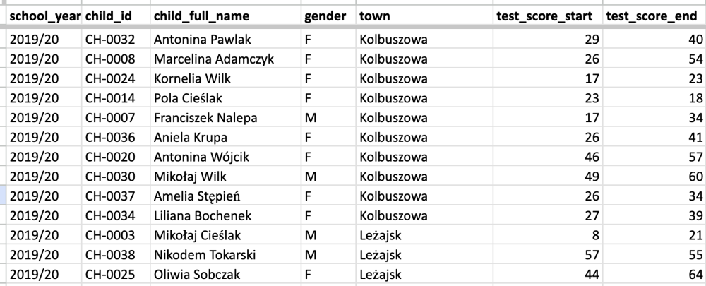 Table 1. Example of personal data gathered for the tutorial's example. See more here.
This is a lot of personal data that cannot be, under any circumstances, shared with AI models. Each row shows data per child per school year, incl.:
children's and parents’ names,
birth year and gender,
phone numbers,
test scores,
attendance rates,
information about special educational needs,
free text notes.
However, there are ways to use AI without disclosing any personal information.
We will test three approaches:
1. We share no data at all: We share just the column names and a description of our situation.
Outcome: ideas for analyses and instructions on how to calculate them.
2. Aggregated data: for example, a pivot table (so nothing about any individual).
Outcome: validation of the results, help in choosing the strongest points, chart ideas.
3. We send a chunk of our raw data, but without columns that contain personal information.
Outcome: the AI model can do the data analysis instead of us. It will look for patterns, perform analyses, and generate insights. It can also generate charts, but I do not recommend relying blindly on them.
These approaches are sequenced by how much data we hand over, from nothing to almost everything.
All three approaches are valuable. The third one is certainly the biggest time-saver, but all the calculations should be checked anyway. The models can make errors, and in the end we are the ones responsible for the data.
Approach One: Share Only Column Names
For deciding what is worth checking or calculating, a model does not necessarily need your data, but it does need to know what kind of data you have.
In order to test this approach, we can use the following prompt (find it here), which includes:
- a description of our organization,
- the situation (in this case, we are preparing for an important meeting with a donor and want to uncover some insights from the data),
- a description of our file and what the columns mean (very important!),
- what we think is worth showing, what our intuition says, what our experience tells us,
- what we want to achieve, for example: "Let's brainstorm what we can show this donor. For each idea, tell me what question it answers for the donor, what I would need to calculate, and where it could mislead. Then tell me which of my four ideas is the weakest and why. Do not produce any chart ideas yet."
I asked for no charts yet, because at this stage the model has no numbers. Its job is only to decide what is worth checking, calculating and showing.
Useful tip: if you don’t want to write such a long prompt, dictate it. It takes less time, you give far more context, and the lack of formatting does not bother the model.
I used the same prompt in both Gemini and ChatGPT. You can find their answers here (Gemini) and here (ChatGPT) I felt that the Gemini answer lacked depth and I liked the ChatGPT response more. Even with the same prompt we can get entirely different results from different models, so if the stakes are high, do not rely on one tool only.
After that, I asked ChatGPT to give me exact instructions on how to calculate the recommended numbers and build the pivot tables:
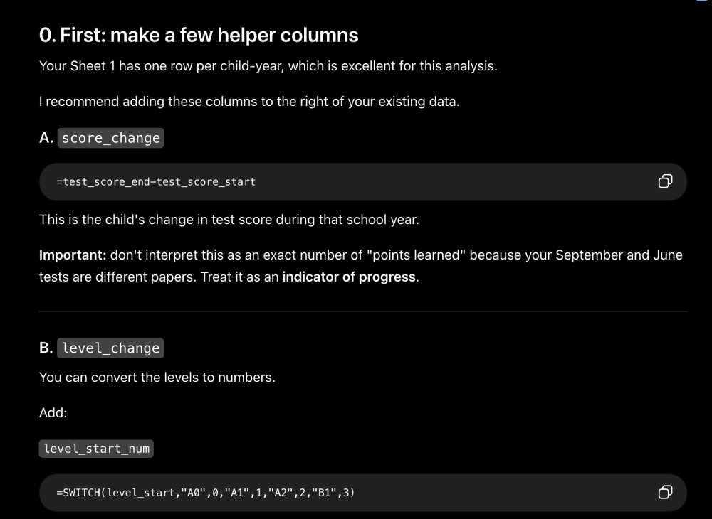 Image 1. Example of the instructions from ChatGPT.
With the instructions, I was able to create helper columns in Google Sheets (in a duplicated sheet "Programme participants calc"):
score_change = the change in test results between the start and the end of the school year,
level_change = the change in the estimated language level (A1, A2, B1, etc.) between the start and the end of the school year,
level_up = a binary variable indicating whether the child moved up a language level (1) or not (0).
Based on the new columns, I can create pivot tables with aggregate students’ results per school year:
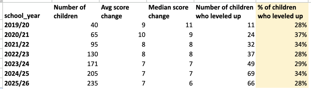 Table 2. Example of pivot table created with the instructions from ChatGPT. See the full table here.
Now, with the results and some specific numbers that we did not have before, we can test the second approach.
Approach Two: Share Aggregated Data
Nothing so far required sharing a single number with AI models. Now, however, I will send screenshots of the pivot tables that contain the most promising results. The one presented above (showing the average test score changes) and another one I created (showing the number of children who leveled up by the number of years with our organization):
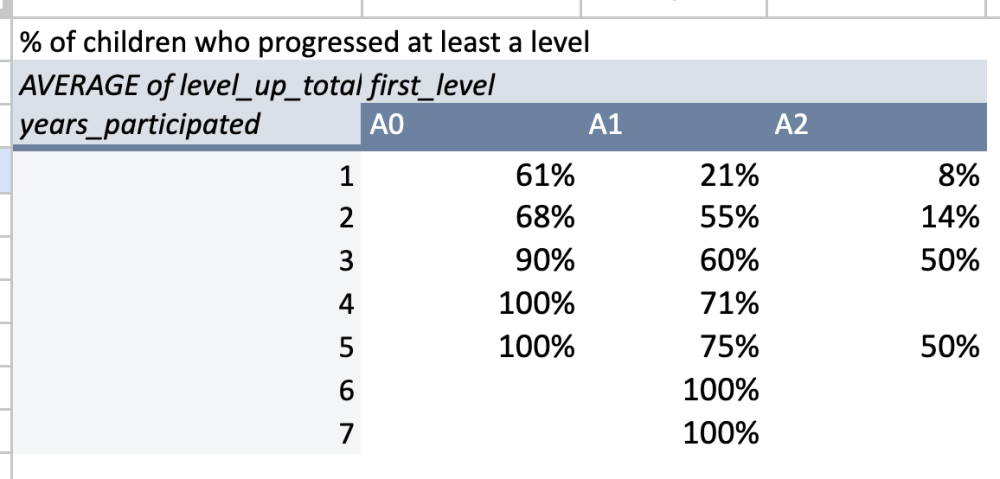
Table 3. Example of another pivot table created with the instructions from ChatGPT. See full table here.
There is no personal data here, just aggregates.
After pasting the previews of the pivot tables into Gemini I asked for chart ideas. The sketches came back as AI-generated images:
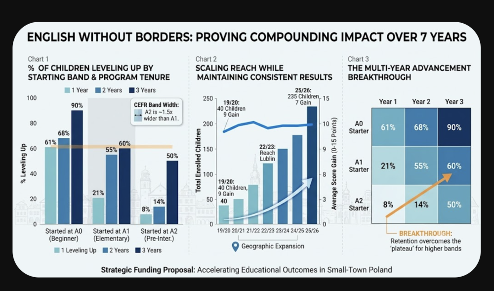 Image 2. The first attempt at the sketch of the chart, by Gemini.
In my opinion, these charts are not directly usable, but they add valuable input. The ideas behind the charts are actually good, and below I will recreate the charts myself to avoid the AI look.
Here is how I recreated the first and the third proposition in Google Sheets and Datawrapper (a free tool for creating data visualizations):
The first idea as a bar chart created with Datawrapper:
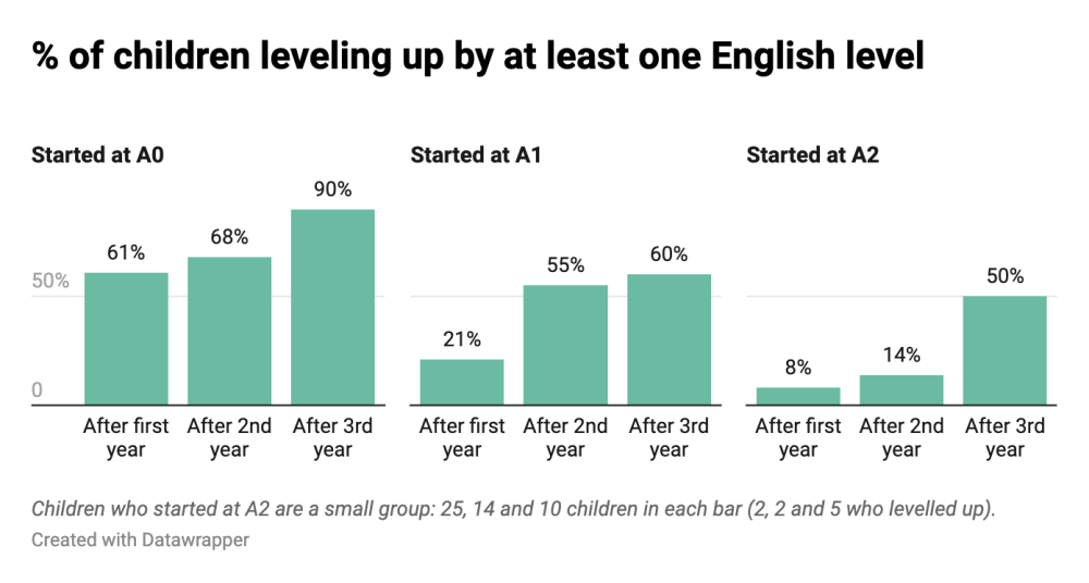 Image 3. Chart created with the data by Datawrapper.
The third idea recreated as a heatmap in Google Sheets:
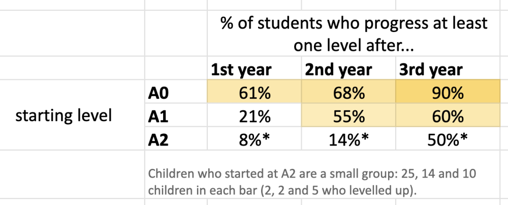
Table 4. Heatmap created with Google Sheets, using the same data. See full heatmap here.
I did not mention this in the video-tutorial, but with the students moving up from A2 we should be transparent about the relatively small sample size, which is why I added a caption with the exact numbers. Percentages are always a little risky with a small number of observations. It is also why I stopped at three years: from the fourth year on we are down to a handful of children.
The charts look good to back our story of success, but to be fully transparent with our donor, we should mention two more things:
survivorship bias. In our example, the "After 3rd year" column contains only children who stayed with us for three years. These are usually the children who were already doing well enough to want to stay. So the chart shows that staying longer and progressing go together. It does not prove that the time spent in the program causes the progress.
our classes are not the only English lessons these children have. They all go to school, where English is a mandatory subject, so some of the progress we are measuring may come from there rather than from us. We cannot separate the two with this dataset, and it is better to say that ourselves than to wait for the donor to ask.
I also recreated the middle chart in Google Sheets:
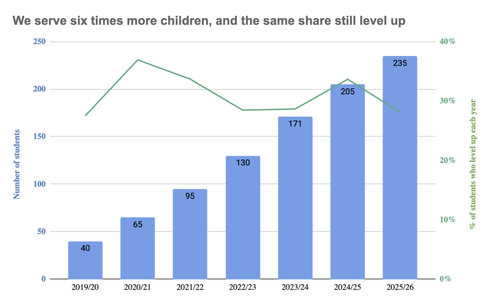 Image 4. Chart using the same data, created with Google Sheets.
This is a strong point: we serve six times more children than in the first year, and the share who move up a level has held. The chart uses two axes, to present that the two series behave differently.
Approach Three: Share Raw Data with AI, but Without Sensitive Information
Sometimes we want the model to calculate our numbers instead of doing it ourselves. However, if we have personal data in the file, we need to prepare it first and remove the columns with personal information.
First, let's remove the direct identifiers: names, phone numbers, volunteers' names, and the free-text notes. Those notes are the field people forget. A sentence like "mother works abroad, child lives with grandmother" identifies a family in a town of four thousand more reliably than a surname does. Let's delete the column.
The second part is just as important, and the video only shows it briefly: removing names is not always enough. What remains are quasi-identifiers, columns that mean nothing on their own but identify a person in combination. Filtering this file to one small town, one year of birth and one type of special educational need returns exactly one child, in a place where the programme teaches four children in total. Under the GDPR the quasi-identifiers are still personal data, because the identification of a real person is possible. So we should remove those columns or replace them with something more general.
There is one more thing to check before we upload anything. On free plans, conversations may be used to improve the models, so check your own organization's rules. Some CSOs have a policy or a donor agreement saying that beneficiary data is not allowed to be shared with third party services at all, anonymised or not.
Our dataset without sensitive data looks like this:
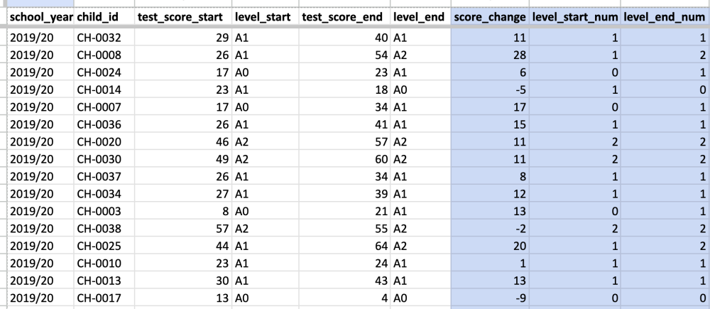 Table 5. Data set on the possible test scores, level start and end scores, after hiding the personal data (that would make it easy to identify the participants). See the full data set here.
Once the dataset is limited to “safe” columns, we can upload it to an AI model and ask it to analyse this data focusing on the learning outcomes of students.
What we gain with the third approach is speed. ChatGPT recalculated the learning outcomes from the uploaded file very quickly, much faster than I did:
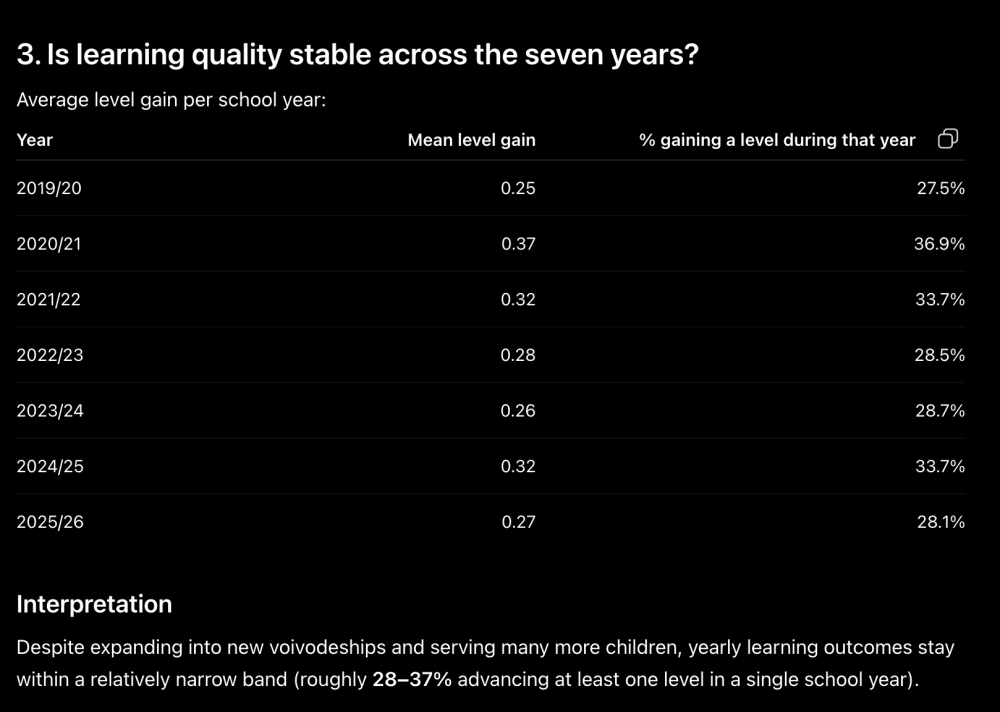 Image 5. Learning outcomes calculated by ChatGPT.
Even so, for a meeting with this much at stake I would not put a model-generated number on a slide without calculating it myself. This is still a use case worth naming, though: you can ask an AI model to double-check the analysis you have already done.
Pros and Cons of Each Approach
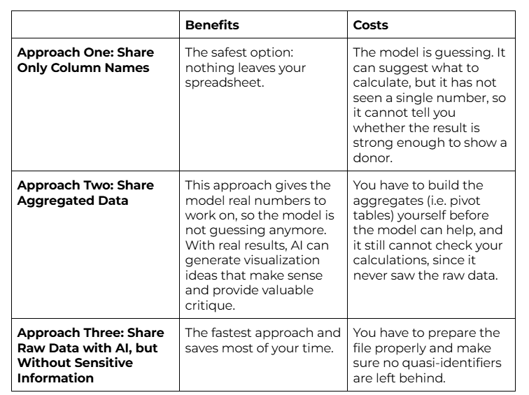 Table 6. Pros and Cons of the three approaches.
Judgement Above Prompting
The models were useful in each of the three approaches, but they were also wrong or shallow in places. They do not know our organization, they do not know our donor, and they cannot tell from a column name why a number looks the way it does.
In the end, it is our judgement that decides. We know the organization, we know what the donor asked about the last time, and we are the ones who will be standing in front of them. When we pair that with the speed of these tools, a strong donor presentation (or any other data-based material) can be put together much faster, even in a busy fortnight.
End note: in the article and video-tutorial I focused on educational outcomes. Of course, the donor will also ask about cost per child, about the gap between applications and places, and about finance. We did not have time to cover everything, but the same logic applies.
I hope you found this article useful. Good luck! :-)
List Of Resources
- The dataset, in a shared Google Sheet, along with my working sheet from the tutorial, with the calculated columns, the pivot tables and the charts.
- The full prompt with both models' complete answers
Your Feedback Matters
What did you think of this text? Take 30 seconds to share your feedback and help us create meaningful content for civil society!

Disclaimers
This piece of resource has been created as part of the AI for Social Change project within TechSoup's Digital Activism Program, with support from Google.org.
AI tools are evolving rapidly, and while we do our best to ensure the validity of the content we provide, sometimes some elements may no longer be up to date. If you notice that a piece of information is outdated, please let us know at content@techsoup.org.
The content was created, reviewed, and edited by Klaudia Stano with AI assistance.
About The Author
Klaudia Stano is a data analyst and educator specializing in data communication and data visualization. She has been sharing her knowledge on jezykdanych.pl since 2021. She initiated #BI_NGO, a volunteer project that connects analytics enthusiasts with non-profit organisations that need support in presenting their data in an engaging way. She is the founder of #BI_NGO, a volunteer project that connects analytics enthusiasts with non-profit organisations that need support in presenting their data in an engaging way. From 2018 to 2026, she worked at the Katalyst Education Foundation as a project manager and data analyst. Through her educational work (training sessions, courses, articles and consultations), she helps people present data clearly, accurately and accessibly, so that valuable analyses and recommendations don't go unnoticed but are truly seen and appreciated. She believes that numbers and statistics, when communicated clearly, can engage audiences and inspire them to take action.